
Nautical charts are coastal maps showing water depth, navigational hazards, navigational aides (buoys, lighthouses, etc.) and land/topographical features. Charts are essential to good seamanship and there was a time, not too long ago, when almost all our goods arrived to us by sail. Despite all our high tech navigational wizardry, most countries still require vessels to carry paper charts.

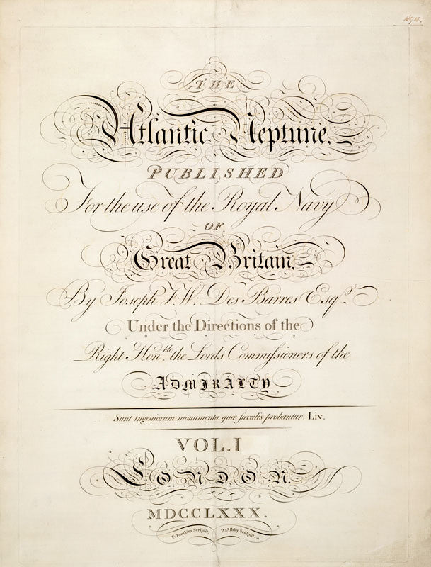
America's chart making started during the Revolutionary War when the British mapped many of our principle harbors for military and trade purposes in one compendium called The Atlantic Neptune. This atlas created a solid foundation for the American coastal surveyors, but we still had our work cut out for us. After all it's a BIG country and was growing very fast.
Below: the British created the first charts of the new colonies, which provided a strong foundation for American coastal surveyors. At the time it was the best sea atlas the world had seen.


Keep in mind that for most of the 19th Century the cheapest and fastest way to get a bale of cotton from, say Charleston, SC to Albany, NY was by sail.
Below: New York's South Street Seaport, c. 1850. New York's ports were described as a "forest of ships' masts" from every part of the globe.

Below: the quintessential American Cat Boat, considered to be the "pick-up truck" of the 19th C.
As late as the 1930’s product of all kind was moved by huge square riggers. Have a look at this fascinating video on the Peking rounding Cape Horn carrying goods to California.
The golden age of American chart cartography is from 1935-1965. Notice the beauty of the hand drawn topographical features, the rich colors and the serif fonts which are now, regrettably, a thing of the past. Before 1935, charts were commonly drawn completely in black ink, making it difficult to distinguish land from sea. The addition of color to charts was pure 1930s!
Below: an example of the typography, color and hand drawn line of the 1935 Chart of Newport Harbor, showing Fort Adams, now a state park.
The golden era of chart cartography came to a screeching halt with the addition of Loran Lines (the cross-hatched green and purple lines, below) and day-glow yellow which appears after 1965. Loran was a pre-PGS navigational tool which is now obsolete, and Loran lines have since been removed from charts. Removing the Loran lines has not helped the charts regain it's lost beauty.

Despite our reliance on digital navigational tools for traveling by sea (yes, there's an app for that) paper charts are still BEST for planning out voyages and understanding the big picture. One of the principal reason I use charts for Mapisart? Inspiration! Inspiration to dream and reminisce of voyages gone by, but mostly to spur the next great maritime adventure!
We make lots of fun things with maps and nautical charts that will inspire your next great voyage by land or by sea!
